Kyle P. O'Brien

I am a senior undergraduate student at the University of Maryland, Baltimore County (UMBC) studying Political Science, History, and GIS.
I am reachable by e-mail at kobrien2@umbc.edu or kyleobrien1204@gmail.com and by phone at 443-900-4066.
Please feel free to contact me with any questions or comments.
Washington D.C. Chronic Inequality Spotlight

Project Description
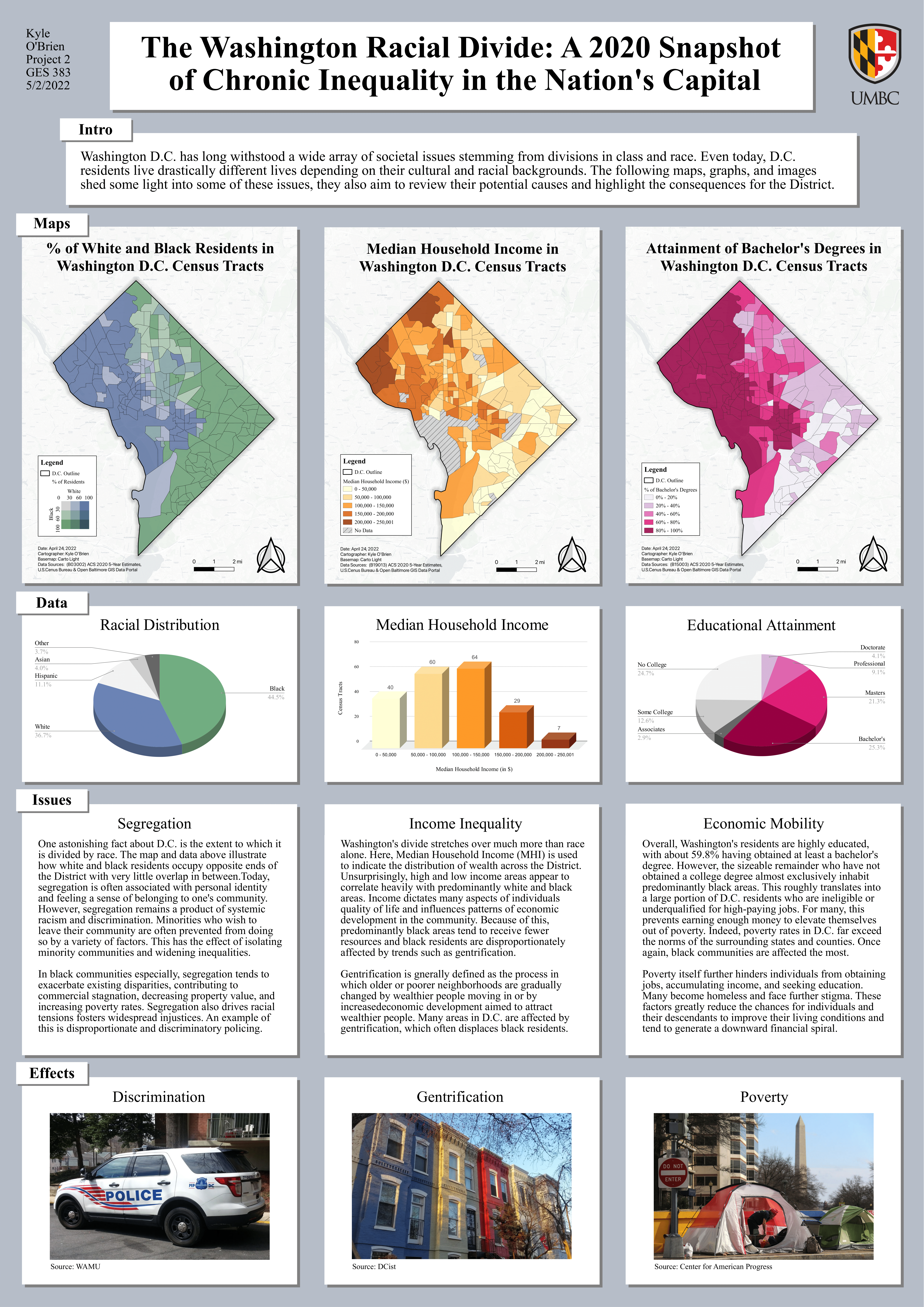
The following maps were originally visualized in a poster created with Inkscape documenting chronic inequality in Washington D.C. included here. Each of the maps were created in QGIS using 2020 US Census Bureau ACS data downloaded with tidycensus in RStudio.

Description:
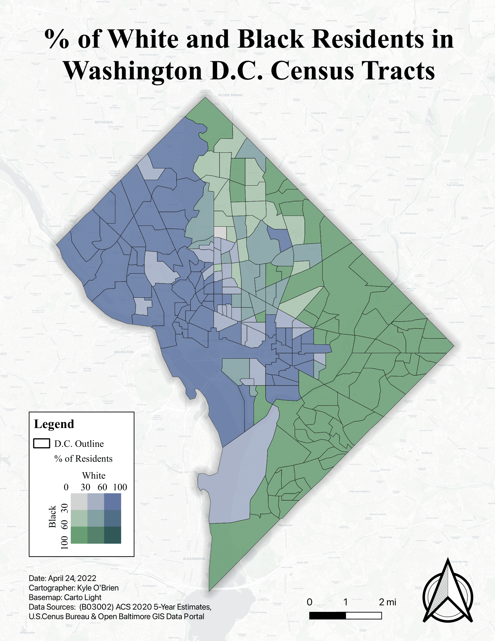
This bivariate choropleth map was created in QGIS using 2020 US Census Bureau ACS data downloaded with tidycensus in RStudio. The variables used were sourced from Table B03002 for Hispanic or Latino Origin by Race. Percentages of the white population and black populations were generated for each census tract and separated into three categories each. The bivariate symbology was then created by blending the % black layer over the % white layer and a legend was created with the Bivariate Legend plugin in QGIS. The end visualization shows how racially divided Washington D.C in the analysis of predominantly white and black census tracts.

Description:
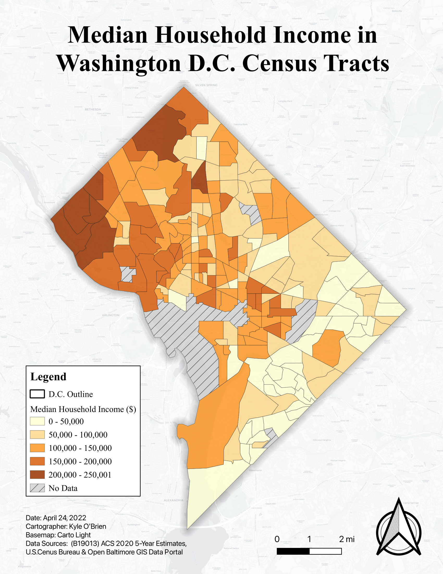
This binned choropleth map was also created in QGIS using 2020 US Census Bureau ACS data downloaded with tidycensus in RStudio. The variables used were sourced from Table B19013 for Median Household Income (MHI) in dollars. Manual bins were generated to neatly separate the data and so that they could later be visualized conveniently in an accompanying histogram. Several tracts contained no MHI estimates and are visualized as such with a legend entry. The end visualization shows how wealth in Washington D.C is roughly divided into the high-income West and low-income East. In conjunction with the previous map, this suggests that wealth is concentrated roughly along racial lines.

Description:
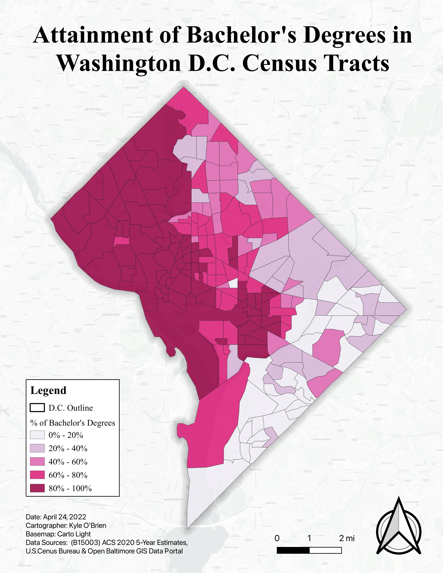
This simple choropleth map was also created in QGIS using 2020 US Census Bureau ACS data downloaded with tidycensus in RStudio. The variables used here were sourced from Table B15003 for Educational Attainment. To visualize the percentage of residents per census tract that had attained at least a bachelor’s degree, variables below a bachelor’s degree (“No school” to “Associates”) were combined into one category, while variables above and including a bachelor’s degree (“Bachelors” to “Doctorate”) were combined into another. The second category was then computed into a percentage out of the total residents per census tract. The end visualization shows how college education is roughly divided between the East and West of Washington D.C.. In conjunction with the previous two maps, this once again highlights a trend of inequality along racial lines in the District.